MeasureMap from AdaptivePath
For the past two weeks I have been looking at a new blog stats package from Adaptive Path called MeasureMap. What follows is a feedback email that I sent them. I haven’t heard anything from them, but they welcomed people posting the information.
Overall, I like it very much, but naturally had lots of comments.
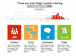
First of all, let me say that I am very impressed with this application. I can imagine a whole world of hosted bloggers who have never seen these kinds of stats before being blown away by some of this data.
Also, before I start telling you what I would do to improve the application, I should state upfron that I don’t understand your business model to understand how you are going to make money doing this – I am assuming it will be by up-selling other services (advanced tracking, realtime tracking, advice, etc…)
That said, here I go…
UI
Colors
I like the vibrant red, orange, blue and green icons, but I think it doesn’t work well with the brown/grey header and other UI elements. I think that it would be better to stay with more white/black/dark grey there. Same for all the small square icons, get rid of the grey.
Navigation
First of all, there is no ‘home’ or ‘overview’ button/link. You have to click on the logo to get there. I think you should have one.
![]()
The bigger issue I have is that while I love the horizontal overview on the home page, I think that the individual overview pages change too much to vertical. I would recommend making the homepage vertical as well and leaving the larger buttons up on the left, so that clicking on an individual overview ‘opens’ up the other options for that page and changed the main content. This would effectively give you 5 main pages (Overview, Visitor Overview, Links Overview, Comments Overview, Posts Overview) that could all borrow the same template and layout.
Calls to Action

I am referring to the links at the bottom of the overviews (eg “People come to your blog in lots of ways. Learn how you can grow the number of visitors.”)… I think these should be set out from the page more. Perhaps in a shaded box.
Visitors Overview
I also think that BROWSERS, COUNTRIES, TIMES links should only be on the Visitors Overview as they are really just detail about visitors.
Dates and Date Sliders
![]()
Very cool. Perhaps not a big issue, but I would recommend a few tweaks. I would leave the actual date/date range as text, outside the grey box. I would just have the little calendar icon (not even the arrow). I think people will click it.
Then I would have a little explanatory text when it opens.
“Click on a bar to examine a specific date, move the slider to select a date range or click ‘Today’ to look at only today’s data”
If you don’t want to do that, I would turn ‘Today’ into ‘Select Today’, as it doesn’t just ‘go to’ today.
Also, you might want to put a legend on this saying ‘Visitors’ somewhere.
Application
Days Before I Started the Service
Minor point, but I just stated using the tool, but older dates say “0 Visitors/Posts” etc… it would be nicer to either have no data for days before you started, or change the note to say “no data” or something other than 0. I could imagine people wondering why you haven’t parsed their log files.
Link Titles
You amazingly get the <title> from the pages that are linked. I think you should also append the site name/url to the title to provide more context on crapily titled pages.
Example:
“Local links” could be either “St Margaret’s Estate Residents Association : Local links” or even “www.smera.freeserve.co.uk : Local links”

Link Lists
You should make the overflow: hidden on these to make sure really long links don’t push the page out too far.
Your Titles
![]()
| For bookmarking alone, I would rearrange them from “<Page Name> | MeasureMap” to “MeasureMap | <Page Name>”. |
Post & Comment List Incoming/Outgoing Visitors Count Icon
This isn’t too obvious what it is from the Icon… perhaps just a simple “Links in/out” instead would be better?
Link, Comment, Post Sub Pages
![]()
I love these pages, but I think the layout should be better. I see the name of the page appears in the left, under the main icon, but it could be clearer in the main content section.
Example:
“Details for the post Details Emerge on Tesco’s Loading Bay during 28 - 31 October 2005 “
could be clearer with words and line breaks
Post Detail for Details Emerge on Tesco’s Loading Bay during 28 - 31 October 2005
Data
Visits?
I think a raw number for visits would be important. You have the data, I think visitors and visits per is important.
Accuracy
I don’t know exactly how you are tracking, but now I have three slightly conflicting sets of data. I probably can mentally account for the differences, but incase you were interested.
For 30 Oct 2005
| MeasureMap | 26 Visitors |
| AWSTATS | 72 Visits |
| GREP Homepage Log | 52 Visits |
Non-blog Content
Admittedly most people probably don’t do this, but I have a lot of content served up via cgi scripts and an static content based CMS. It would be important to me to have this tracked. I am testing right now to see if I can just append the javascript code to get this as well, but if you do allow it, it would be good to tell people how.
I think I will stop now.
I really do like it.
No slideshow images defined in front matter for this page.
Comments
Add a comment